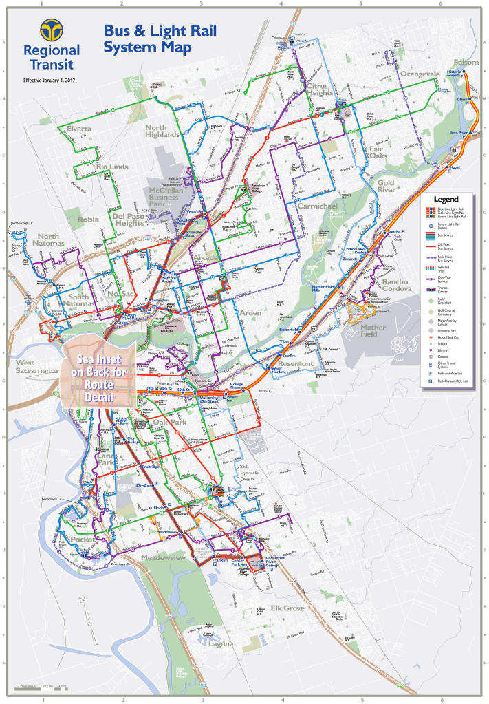
Update: Added the January 2017 SacRT system map to the bottom of the post. It makes good use of color to distinguish bus routes, but does not contain any frequency information except off-peak routes.
SacRT’s system map scores low on usability. All fixed route bus service, except commuter routes, are shown in the same color and the same line thickness, a light blue thin line. There is no indication whatsoever that some routes offer better service than others. Routes 1, 51, and 81 are shown in the same color and line width as every other bus route, though they have 15-minute service. On the other hand, the light rail lines are shown in a very heavy line, even though they have the same 15-minute service as these three high frequency buses (though the buses have a somewhat shorter span of service). Even the Green Line, which does not have 15-minute service, and the Gold Line beyond Sunrise Station, which does not have 15-minute service, are shown in heavy lines.
I asked the Transit app about the colors shown for bus lines. They said they use the colors provided in GTFS (General Transit Feed Specification), so whatever the agency provides is what they use. So for SacRT, the three light rail lines are in their named color (Blue, Gold, Green) and all the other routes are in light blue (even the commute routes, which are at least red on the map). They don’t have the capability of analyzing service frequency to determine if a different color should be used. Google Maps seems to randomly assign colors to routes, but does not show route lines on the map.
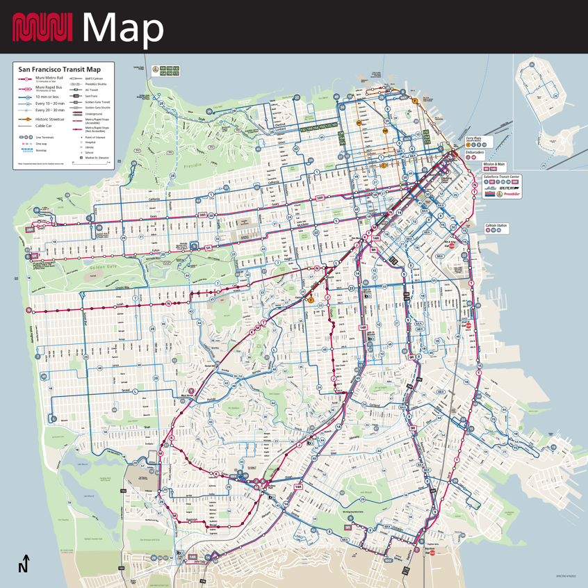
Below is the SFMTA Muni map (San Francisco). It is not perfect, but does provide an example of a nearby system that many readers have used. It shows both light rail (Muni Metro), but not so prominently, and bus service. It has information about bus frequency, shown in colors and line thickness. The rapid service and light rail (Muni assigns letters, not colors, to its light rail), is shown in red, very easy to see, and differing categories of bus service are indicated by differing line thickness.
STAR has recommended to SacRT that they update and improve the system map, along with the September 2022 service changes.

One thought on “time for a new SacRT system map”